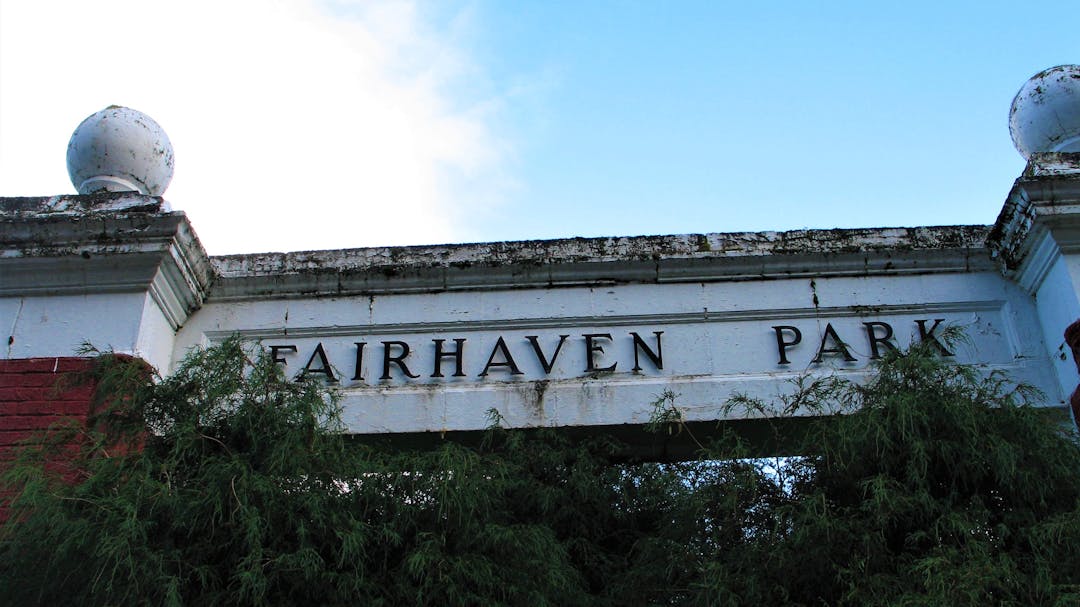
Fairhaven Park Entrance Sign
Consultation has concluded

The purpose of this project is to construct a new park sign for the entrance to this historic park and the adjacent Chuckanut Community Forest. The proposed entryway structure will be located at the main entrance to the park on Chuckanut Drive.
Built in 1925, the former Fairhaven Park entrance columns were removed due to safety concerns in 2016. The structure could not be rebuilt in place due to the lack of structural reinforcement and severe deterioration. A temporary park sign now sits at the entrance of the park.
The former Fairhaven Park columns were designed by prominent architect F. Stanley Piper. The columns were noted as deteriorated in 1976 when an attempt was made to restore the structure. Over time, some of the columns were removed due to damage with the final removal occurring in 2016.
Prior to 1925, the original entrance to the park was marked by a large, rustic timber-style gateway structure with Adirondack style embellishments, erected in 1915, which only lasted about 10 years.
We invite you to watch this short presentation, review the key documents, and provide feedback by taking our quick poll, calling, emailing, asking a question, or typing in the guest book section below.
Design Options
Option 1: Flag pole plaza. Low wall for clear lines of sight, color to evoke Chuckanut sandstone, finials to recall the former archway columns.

Option 2: Historic monument with lantern. A monument landmark, yet subordinate to the park landscape, use of natural materials, Olmstedian lantern.

Option 3: Single landmark column, recalling previous columns in use of materials, finials to recall the former archway columns.

Option 4: Smaller scale, brick façade column, similar to other pillars scattered throughout Fairhaven.


As someone who donated money to park district specially earmarked for a new entrance, I look forward to seeing a new entryway. I would have preferred to have saved or reconstructed the original entrance, as it was a valuable historical landmark, imo. Number 4 is the best option the city has provided because it has a stronger sense of place and to Fairhaven.
Removed by moderator.
No need for a $75,000 sign. Please use the money to fix The Arroyo so that our community can hike, ride, and bike there.
I prefer the look of the existing brick columns that are already scattered throughout Fairhaven. Why introduce a different design motif when a classic one already exists. The new contemporary signs look like they belong at the entrance to a strip mall. Yuck!