Fairhaven Park Entrance Sign
Consultation has concluded
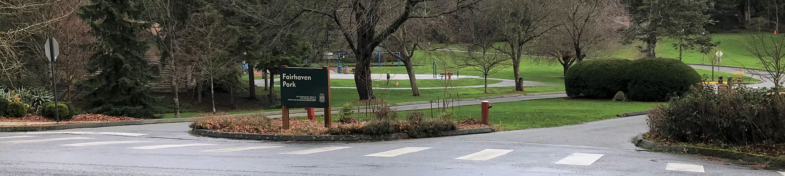
The purpose of this project is to construct a new park sign for the entrance to this historic park and the adjacent Chuckanut Community Forest. The proposed entryway structure will be located at the main entrance to the park on Chuckanut Drive.
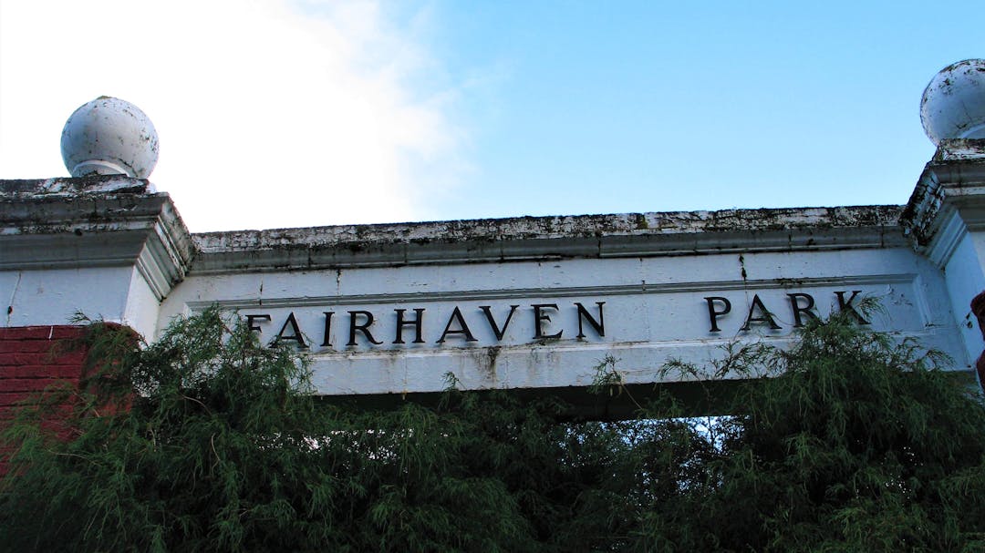
Built in 1925, the former Fairhaven Park entrance columns were removed due to safety concerns in 2016. The structure could not be rebuilt in place due to the lack of structural reinforcement and severe deterioration. A temporary park sign now sits at the entrance of the park.
The former Fairhaven Park columns were designed by prominent architect F. Stanley Piper. The columns were noted as deteriorated in 1976 when an attempt was made to restore the structure. Over time, some of the columns were removed due to damage with the final removal occurring in 2016.
Prior to 1925, the original entrance to the park was marked by a large, rustic timber-style gateway structure with Adirondack style embellishments, erected in 1915, which only lasted about 10 years.
We invite you to watch this short presentation, review the key documents, and provide feedback by taking our quick poll, calling, emailing, asking a question, or typing in the guest book section below.
Design Options
Option 1: Flag pole plaza. Low wall for clear lines of sight, color to evoke Chuckanut sandstone, finials to recall the former archway columns.

Option 2: Historic monument with lantern. A monument landmark, yet subordinate to the park landscape, use of natural materials, Olmstedian lantern.

Option 3: Single landmark column, recalling previous columns in use of materials, finials to recall the former archway columns.

Option 4: Smaller scale, brick façade column, similar to other pillars scattered throughout Fairhaven.

The purpose of this project is to construct a new park sign for the entrance to this historic park and the adjacent Chuckanut Community Forest. The proposed entryway structure will be located at the main entrance to the park on Chuckanut Drive.
Built in 1925, the former Fairhaven Park entrance columns were removed due to safety concerns in 2016. The structure could not be rebuilt in place due to the lack of structural reinforcement and severe deterioration. A temporary park sign now sits at the entrance of the park.
The former Fairhaven Park columns were designed by prominent architect F. Stanley Piper. The columns were noted as deteriorated in 1976 when an attempt was made to restore the structure. Over time, some of the columns were removed due to damage with the final removal occurring in 2016.
Prior to 1925, the original entrance to the park was marked by a large, rustic timber-style gateway structure with Adirondack style embellishments, erected in 1915, which only lasted about 10 years.
We invite you to watch this short presentation, review the key documents, and provide feedback by taking our quick poll, calling, emailing, asking a question, or typing in the guest book section below.
Design Options
Option 1: Flag pole plaza. Low wall for clear lines of sight, color to evoke Chuckanut sandstone, finials to recall the former archway columns.
Option 2: Historic monument with lantern. A monument landmark, yet subordinate to the park landscape, use of natural materials, Olmstedian lantern.
Option 3: Single landmark column, recalling previous columns in use of materials, finials to recall the former archway columns.
Option 4: Smaller scale, brick façade column, similar to other pillars scattered throughout Fairhaven.
Please feel free to ask a question about this project.
-
Share As nice as it might be to have a more substantial new entrance sign to replace the "temporary" one in place currently, the "temporary" sign appears to me to be plenty visible, plenty stylishly good-looking, plenty honorary of the great beauty of the park, identifies the park plenty well, so why not leave it as it is now and use precious funds to feed or house less fortunate citizens of Bellingham, or fill other truly pressing needs (hire one more police officer to be of assistance when the police department claims to be so short-handed that they can't enforce laws)? Thank you for your consideration. on Facebook Share As nice as it might be to have a more substantial new entrance sign to replace the "temporary" one in place currently, the "temporary" sign appears to me to be plenty visible, plenty stylishly good-looking, plenty honorary of the great beauty of the park, identifies the park plenty well, so why not leave it as it is now and use precious funds to feed or house less fortunate citizens of Bellingham, or fill other truly pressing needs (hire one more police officer to be of assistance when the police department claims to be so short-handed that they can't enforce laws)? Thank you for your consideration. on Twitter Share As nice as it might be to have a more substantial new entrance sign to replace the "temporary" one in place currently, the "temporary" sign appears to me to be plenty visible, plenty stylishly good-looking, plenty honorary of the great beauty of the park, identifies the park plenty well, so why not leave it as it is now and use precious funds to feed or house less fortunate citizens of Bellingham, or fill other truly pressing needs (hire one more police officer to be of assistance when the police department claims to be so short-handed that they can't enforce laws)? Thank you for your consideration. on Linkedin Email As nice as it might be to have a more substantial new entrance sign to replace the "temporary" one in place currently, the "temporary" sign appears to me to be plenty visible, plenty stylishly good-looking, plenty honorary of the great beauty of the park, identifies the park plenty well, so why not leave it as it is now and use precious funds to feed or house less fortunate citizens of Bellingham, or fill other truly pressing needs (hire one more police officer to be of assistance when the police department claims to be so short-handed that they can't enforce laws)? Thank you for your consideration. link
As nice as it might be to have a more substantial new entrance sign to replace the "temporary" one in place currently, the "temporary" sign appears to me to be plenty visible, plenty stylishly good-looking, plenty honorary of the great beauty of the park, identifies the park plenty well, so why not leave it as it is now and use precious funds to feed or house less fortunate citizens of Bellingham, or fill other truly pressing needs (hire one more police officer to be of assistance when the police department claims to be so short-handed that they can't enforce laws)? Thank you for your consideration.
Fairhaven Fred asked about 4 years agoThank you for your comment and for taking the time to review the designs.
-
Share I like the Idea of trying to replicate what was there. I think having the two columns on either side of the entrance like in option 3 but also having a larger sign in the middle similar to 1 or 2 where the sign is easier to read and more obvious would be good. on Facebook Share I like the Idea of trying to replicate what was there. I think having the two columns on either side of the entrance like in option 3 but also having a larger sign in the middle similar to 1 or 2 where the sign is easier to read and more obvious would be good. on Twitter Share I like the Idea of trying to replicate what was there. I think having the two columns on either side of the entrance like in option 3 but also having a larger sign in the middle similar to 1 or 2 where the sign is easier to read and more obvious would be good. on Linkedin Email I like the Idea of trying to replicate what was there. I think having the two columns on either side of the entrance like in option 3 but also having a larger sign in the middle similar to 1 or 2 where the sign is easier to read and more obvious would be good. link
I like the Idea of trying to replicate what was there. I think having the two columns on either side of the entrance like in option 3 but also having a larger sign in the middle similar to 1 or 2 where the sign is easier to read and more obvious would be good.
Kolter Larsen asked over 4 years agoYour comment has been received.
-
Share What’s wrong with the current sign? I would much rather see the money used for renovations and maintenance, such as resurfacing the tennis courts and lining both courts for pickleball. on Facebook Share What’s wrong with the current sign? I would much rather see the money used for renovations and maintenance, such as resurfacing the tennis courts and lining both courts for pickleball. on Twitter Share What’s wrong with the current sign? I would much rather see the money used for renovations and maintenance, such as resurfacing the tennis courts and lining both courts for pickleball. on Linkedin Email What’s wrong with the current sign? I would much rather see the money used for renovations and maintenance, such as resurfacing the tennis courts and lining both courts for pickleball. link
What’s wrong with the current sign? I would much rather see the money used for renovations and maintenance, such as resurfacing the tennis courts and lining both courts for pickleball.
S & J Wagoner-Lynch asked over 4 years agoYour comment has been received. We are also looking at the condition of the sport court striping and resurfacing.
-
Share I keep the existing sign as it is readable to motorists. Also, repaint the crosswalk and paint the curb white on the island. on Facebook Share I keep the existing sign as it is readable to motorists. Also, repaint the crosswalk and paint the curb white on the island. on Twitter Share I keep the existing sign as it is readable to motorists. Also, repaint the crosswalk and paint the curb white on the island. on Linkedin Email I keep the existing sign as it is readable to motorists. Also, repaint the crosswalk and paint the curb white on the island. link
I keep the existing sign as it is readable to motorists. Also, repaint the crosswalk and paint the curb white on the island.
Hue Beattie asked over 4 years agoThank you for your comment.
-
Share Hi Gina, I see that after all this time no other options are being offered, despite several community comments requesting/suggesting alternatives. It feels like this forum for public comment is just a nod to the community, a way to say later that public comment was allowed. Clearly you have every intent on moving forward with this project and moving it into the permitting stage regardless of public comments submitted here or elsewhere. on Facebook Share Hi Gina, I see that after all this time no other options are being offered, despite several community comments requesting/suggesting alternatives. It feels like this forum for public comment is just a nod to the community, a way to say later that public comment was allowed. Clearly you have every intent on moving forward with this project and moving it into the permitting stage regardless of public comments submitted here or elsewhere. on Twitter Share Hi Gina, I see that after all this time no other options are being offered, despite several community comments requesting/suggesting alternatives. It feels like this forum for public comment is just a nod to the community, a way to say later that public comment was allowed. Clearly you have every intent on moving forward with this project and moving it into the permitting stage regardless of public comments submitted here or elsewhere. on Linkedin Email Hi Gina, I see that after all this time no other options are being offered, despite several community comments requesting/suggesting alternatives. It feels like this forum for public comment is just a nod to the community, a way to say later that public comment was allowed. Clearly you have every intent on moving forward with this project and moving it into the permitting stage regardless of public comments submitted here or elsewhere. link
Hi Gina, I see that after all this time no other options are being offered, despite several community comments requesting/suggesting alternatives. It feels like this forum for public comment is just a nod to the community, a way to say later that public comment was allowed. Clearly you have every intent on moving forward with this project and moving it into the permitting stage regardless of public comments submitted here or elsewhere.
TLHamilton asked over 4 years agoThank you for your comment. If you have an idea for the new sign, please feel free to submit additional information in the Ideas section of this page. This project page has multiple options for public input. All comments will be forwarded to the Bellingham Parks Board for review and to the Bellingham Arts Commission for final recommendation to the Mayor. The first three options were developed by City staff based on past public input and we appreciate your additional feedback. Option 4 was submitted by a local community member from the Fairhaven District. Others have suggested design options that borrow from the design concepts presented in the four options.
-
Share I would much prefer that all the money go to fixing Arroyo Par so that community members can hike, ride, bike there again. on Facebook Share I would much prefer that all the money go to fixing Arroyo Par so that community members can hike, ride, bike there again. on Twitter Share I would much prefer that all the money go to fixing Arroyo Par so that community members can hike, ride, bike there again. on Linkedin Email I would much prefer that all the money go to fixing Arroyo Par so that community members can hike, ride, bike there again. link
I would much prefer that all the money go to fixing Arroyo Par so that community members can hike, ride, bike there again.
Phaedra asked over 4 years agoThank you for your comment. We are working hard to fix the bridge over the creek and repair several washouts on the upper trails. Stay tuned for project updates on the Parks social media sites or feel free to call or email.
-
Share Needs a sign approaching park " PARK ENTRANCE" with arrow, due to complex traffic situation. (Survey at other parks too. Some are obscure, uncertain, or within residential streets.) on Facebook Share Needs a sign approaching park " PARK ENTRANCE" with arrow, due to complex traffic situation. (Survey at other parks too. Some are obscure, uncertain, or within residential streets.) on Twitter Share Needs a sign approaching park " PARK ENTRANCE" with arrow, due to complex traffic situation. (Survey at other parks too. Some are obscure, uncertain, or within residential streets.) on Linkedin Email Needs a sign approaching park " PARK ENTRANCE" with arrow, due to complex traffic situation. (Survey at other parks too. Some are obscure, uncertain, or within residential streets.) link
Needs a sign approaching park " PARK ENTRANCE" with arrow, due to complex traffic situation. (Survey at other parks too. Some are obscure, uncertain, or within residential streets.)
Bill Thompson asked over 4 years agoThank you for this observation. Fairhaven Park is a great location to add a sign with an arrow on the street. Other community parks in Bellingham could benefit from a traffic sign with arrow as well.
-
Share I am not excited about any of them. The current sign is adequate and $75k is a ridiculous pricetag for such a thing.. Please use that money to make park repairs - such as fixing Arroyo Park bridge and those washouts or fixing the rotting/derelict Woodstock Farm buildings. on Facebook Share I am not excited about any of them. The current sign is adequate and $75k is a ridiculous pricetag for such a thing.. Please use that money to make park repairs - such as fixing Arroyo Park bridge and those washouts or fixing the rotting/derelict Woodstock Farm buildings. on Twitter Share I am not excited about any of them. The current sign is adequate and $75k is a ridiculous pricetag for such a thing.. Please use that money to make park repairs - such as fixing Arroyo Park bridge and those washouts or fixing the rotting/derelict Woodstock Farm buildings. on Linkedin Email I am not excited about any of them. The current sign is adequate and $75k is a ridiculous pricetag for such a thing.. Please use that money to make park repairs - such as fixing Arroyo Park bridge and those washouts or fixing the rotting/derelict Woodstock Farm buildings. link
I am not excited about any of them. The current sign is adequate and $75k is a ridiculous pricetag for such a thing.. Please use that money to make park repairs - such as fixing Arroyo Park bridge and those washouts or fixing the rotting/derelict Woodstock Farm buildings.
John Goodman asked over 4 years agoThank you for submitting this comment.
-
Share In General: You can't set your phone GPS to meet up in parks or share w others. Every entrance to each park should be distinctly named & identifiable on a search. (the street name?) for joining visitors, groups successfully. Please discuss / forward rather than dismiss this. on Facebook Share In General: You can't set your phone GPS to meet up in parks or share w others. Every entrance to each park should be distinctly named & identifiable on a search. (the street name?) for joining visitors, groups successfully. Please discuss / forward rather than dismiss this. on Twitter Share In General: You can't set your phone GPS to meet up in parks or share w others. Every entrance to each park should be distinctly named & identifiable on a search. (the street name?) for joining visitors, groups successfully. Please discuss / forward rather than dismiss this. on Linkedin Email In General: You can't set your phone GPS to meet up in parks or share w others. Every entrance to each park should be distinctly named & identifiable on a search. (the street name?) for joining visitors, groups successfully. Please discuss / forward rather than dismiss this. link
In General: You can't set your phone GPS to meet up in parks or share w others. Every entrance to each park should be distinctly named & identifiable on a search. (the street name?) for joining visitors, groups successfully. Please discuss / forward rather than dismiss this.
Bill Thompson asked over 4 years agoThank you for your comment. All of Bellingham Parks are associated with just one address. You may add a pin in GPS and share that location with others. Please feel free to email us and we can discuss better options.
-
Share Don't let design edge out function. This is a public park's main entrance, so it's important that the sign be easily readable. Even more so in this case, since it has to be readable by a driver coming around the curve at 25mph (or more), getting into a narrow turn lane and negotiating a driveway split by an island and with a crosswalk in front of it. The park's name should be big enough and have enough contrast to be read at a glance. And not be covered by ivy leaves, which would grow out over the letters the second you turned your back on them :). Those are good reasons to go with a permanent version of the sign that's there now. Any lighting should shine on the park's name. I agree with SusanW about setting the sign back for visibility to exit the park, and also about refreshing the plantings across the island and both sides of the driveway. Other than the not-legible-enough name, I like the looks of Option #4 the best in general. A lantern or finial at the top would look more historic (more like the pillar at the corner of the park by Chuckanut Center or like the originals here at the entrance). I realize these are artist's renderings, but the yellow stucco appearance of #1 and #3 doesn't look anything like Chuckanut sandstone to me, and I like a straight column much better than the craftsman-looking tapered column of #3. As other commenters have said, #2 looks too much like entrances to malls or condo developments. If it were built of real Chuckanut sandstone, that might make a difference? I'm not sure. The pattern of an entrance sign with a stone facing is very familiar, so the lantern on this one seems oddly and kind of gracelessly plunked there. When all is said and done, I would favor a short brick column with a hanging flower basket on either side of the driveway, and a standard, very legible park sign on the island. on Facebook Share Don't let design edge out function. This is a public park's main entrance, so it's important that the sign be easily readable. Even more so in this case, since it has to be readable by a driver coming around the curve at 25mph (or more), getting into a narrow turn lane and negotiating a driveway split by an island and with a crosswalk in front of it. The park's name should be big enough and have enough contrast to be read at a glance. And not be covered by ivy leaves, which would grow out over the letters the second you turned your back on them :). Those are good reasons to go with a permanent version of the sign that's there now. Any lighting should shine on the park's name. I agree with SusanW about setting the sign back for visibility to exit the park, and also about refreshing the plantings across the island and both sides of the driveway. Other than the not-legible-enough name, I like the looks of Option #4 the best in general. A lantern or finial at the top would look more historic (more like the pillar at the corner of the park by Chuckanut Center or like the originals here at the entrance). I realize these are artist's renderings, but the yellow stucco appearance of #1 and #3 doesn't look anything like Chuckanut sandstone to me, and I like a straight column much better than the craftsman-looking tapered column of #3. As other commenters have said, #2 looks too much like entrances to malls or condo developments. If it were built of real Chuckanut sandstone, that might make a difference? I'm not sure. The pattern of an entrance sign with a stone facing is very familiar, so the lantern on this one seems oddly and kind of gracelessly plunked there. When all is said and done, I would favor a short brick column with a hanging flower basket on either side of the driveway, and a standard, very legible park sign on the island. on Twitter Share Don't let design edge out function. This is a public park's main entrance, so it's important that the sign be easily readable. Even more so in this case, since it has to be readable by a driver coming around the curve at 25mph (or more), getting into a narrow turn lane and negotiating a driveway split by an island and with a crosswalk in front of it. The park's name should be big enough and have enough contrast to be read at a glance. And not be covered by ivy leaves, which would grow out over the letters the second you turned your back on them :). Those are good reasons to go with a permanent version of the sign that's there now. Any lighting should shine on the park's name. I agree with SusanW about setting the sign back for visibility to exit the park, and also about refreshing the plantings across the island and both sides of the driveway. Other than the not-legible-enough name, I like the looks of Option #4 the best in general. A lantern or finial at the top would look more historic (more like the pillar at the corner of the park by Chuckanut Center or like the originals here at the entrance). I realize these are artist's renderings, but the yellow stucco appearance of #1 and #3 doesn't look anything like Chuckanut sandstone to me, and I like a straight column much better than the craftsman-looking tapered column of #3. As other commenters have said, #2 looks too much like entrances to malls or condo developments. If it were built of real Chuckanut sandstone, that might make a difference? I'm not sure. The pattern of an entrance sign with a stone facing is very familiar, so the lantern on this one seems oddly and kind of gracelessly plunked there. When all is said and done, I would favor a short brick column with a hanging flower basket on either side of the driveway, and a standard, very legible park sign on the island. on Linkedin Email Don't let design edge out function. This is a public park's main entrance, so it's important that the sign be easily readable. Even more so in this case, since it has to be readable by a driver coming around the curve at 25mph (or more), getting into a narrow turn lane and negotiating a driveway split by an island and with a crosswalk in front of it. The park's name should be big enough and have enough contrast to be read at a glance. And not be covered by ivy leaves, which would grow out over the letters the second you turned your back on them :). Those are good reasons to go with a permanent version of the sign that's there now. Any lighting should shine on the park's name. I agree with SusanW about setting the sign back for visibility to exit the park, and also about refreshing the plantings across the island and both sides of the driveway. Other than the not-legible-enough name, I like the looks of Option #4 the best in general. A lantern or finial at the top would look more historic (more like the pillar at the corner of the park by Chuckanut Center or like the originals here at the entrance). I realize these are artist's renderings, but the yellow stucco appearance of #1 and #3 doesn't look anything like Chuckanut sandstone to me, and I like a straight column much better than the craftsman-looking tapered column of #3. As other commenters have said, #2 looks too much like entrances to malls or condo developments. If it were built of real Chuckanut sandstone, that might make a difference? I'm not sure. The pattern of an entrance sign with a stone facing is very familiar, so the lantern on this one seems oddly and kind of gracelessly plunked there. When all is said and done, I would favor a short brick column with a hanging flower basket on either side of the driveway, and a standard, very legible park sign on the island. link
Don't let design edge out function. This is a public park's main entrance, so it's important that the sign be easily readable. Even more so in this case, since it has to be readable by a driver coming around the curve at 25mph (or more), getting into a narrow turn lane and negotiating a driveway split by an island and with a crosswalk in front of it. The park's name should be big enough and have enough contrast to be read at a glance. And not be covered by ivy leaves, which would grow out over the letters the second you turned your back on them :). Those are good reasons to go with a permanent version of the sign that's there now. Any lighting should shine on the park's name. I agree with SusanW about setting the sign back for visibility to exit the park, and also about refreshing the plantings across the island and both sides of the driveway. Other than the not-legible-enough name, I like the looks of Option #4 the best in general. A lantern or finial at the top would look more historic (more like the pillar at the corner of the park by Chuckanut Center or like the originals here at the entrance). I realize these are artist's renderings, but the yellow stucco appearance of #1 and #3 doesn't look anything like Chuckanut sandstone to me, and I like a straight column much better than the craftsman-looking tapered column of #3. As other commenters have said, #2 looks too much like entrances to malls or condo developments. If it were built of real Chuckanut sandstone, that might make a difference? I'm not sure. The pattern of an entrance sign with a stone facing is very familiar, so the lantern on this one seems oddly and kind of gracelessly plunked there. When all is said and done, I would favor a short brick column with a hanging flower basket on either side of the driveway, and a standard, very legible park sign on the island.
LBC asked over 4 years agoThank you for your thoughtful comments. All good points. We sincerely appreciate the feedback on the design concepts.
Who's Listening
-
Project Manager
Bellingham Parks & Recreation Department, Design & Development Division

Phone (360) 778-7000 Email gaustin@cob.org -
JS
Phone (360) 778-7015 Email jschilk@cob.org
Key Dates
-
March 31 2022
-
March 01 → March 31 2022
-
September 01 → December 30 2022
-
February 06 → March 31 2023
